How to add custom buttons in Dubsado with CSS code
Buttons are a powerful tool to elevate your proposals, guiding clients to relevant pages where they can learn more about you and your work, and even schedule a call. They might seem small, but they add that extra zing to your proposals that will help make your clients feel confident in what you do best.
If you're a coding newbie, then buttons are a great way to dip your toes in with experimenting with CSS! We'll be covering colors, borders, background colors, padding, and drop shadows.
In this tutorial, we are going to learn how to add buttons to your Dubsado proposal, and how to do basic customisations with CSS. Please make sure you are using the new form builder (not legacy mode).
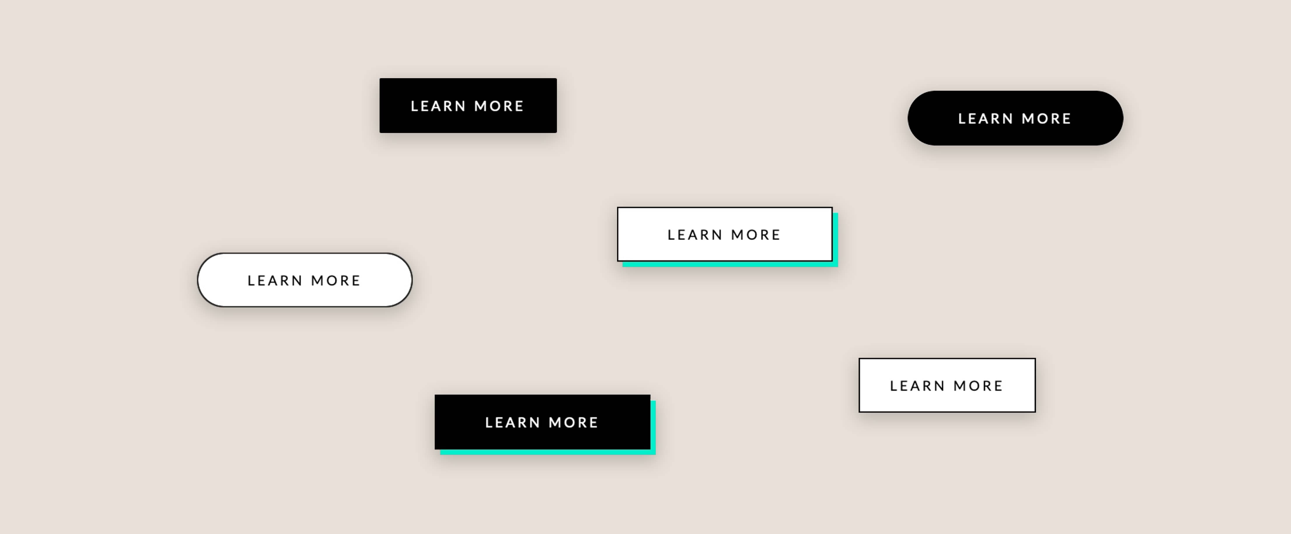
Plug and Play Code Snippets
If you want beautiful buttons—like yesterday—without delving into learning CSS code, we've got you covered. We've prepared some plug-and-play button styles for you to copy and paste straight into your Dubsado fom:
Add a Dubsado Button
There's no code required with adding buttons in Dubsado forms, simply open up your form template on a desktop or laptop (if you're trying to code on a phone— it can be done but you're nuts, and good luck!) to get started:
- Drag in a Text Box where-ever you want your button to appear (or use an existing Text box)
- Click Formatting Options → Insert Link or Button → Button
- Type in the URL
- Type in the Text for the button
- Check "Open in new tab" (pro tip: always do this for linking to external pages)
Now you can leave it like that, but if you want to jazz it up and make it look on-brand, read on for some coding magic...

Getting Started with CSS
So now we have our button, let's get rid of the default styling and use some CSS code to make it on brand. First, head to Form Styling → Edit CSS and add in the below code:

.form-viewer a.dubsButton, a.dubsButton {
	line-height: 1;

}
.form-viewer a.dubsButton:hover, a.dubsButton:hover {
	text-decoration: none;
}
The gap in the highlighted row above? That's where our customisations are going to go (leave the rest of the code untouched)— we'll stack each one on top of each other like this:
.form-viewer a.dubsButton, a.dubsButton {
	line-height: 1;
	background-color: #ffffff;
	color: #000000;
	border: 1px solid #000000;
	box-shadow: none;
	padding: 20px;
}
Thankfully, the language of CSS code is pretty easy-to-understand — you can probably guess what each property refers to:

Use CSS to add styling
Before we begin customising our button, make sure you have your brand color hex codes (e.g. #000000) — if you don't have them to hand, or you just want to play around with a random palette, take a look at some of the color palettes available here: Colors and Fonts and HTML Color Codes.
To better illustrate the styling options (aka CSS properties), we'll be customising the button below:
learn moreBackground Color
learn more.form-viewer a.dubsButton, a.dubsButton {
line-height: 1;
background-color: #ffd0ff !important;
}
.form-viewer a.dubsButton:hover, a.dubsButton:hover {
text-decoration: none;
}
As default, the background color of your button will be the same as the brand color that you entered under Brand Settings:

Text Color
learn more.form-viewer a.dubsButton, a.dubsButton {
line-height: 1;
background-color: #ffd0ff !important;
color: #ffffff !important;
}
.form-viewer a.dubsButton:hover, a.dubsButton:hover {
text-decoration: none;
}
Borders
learn more.form-viewer a.dubsButton, a.dubsButton {
line-height: 1;
background-color: #ffd0ff !important;
color: #1f1f1f !important;
border: 1px solid #1f1f1f !important;
}
.form-viewer a.dubsButton:hover, a.dubsButton:hover {
text-decoration: none;
}
Padding
You can either set the same padding for all 4 sides of your button:
learn more.form-viewer a.dubsButton, a.dubsButton {
line-height: 1;
background-color: #ffd0ff !important;
color: #1f1f1f !important;
border: 1px solid #1f1f1f !important;
padding: 20px;
}
.form-viewer a.dubsButton:hover, a.dubsButton:hover {
text-decoration: none;
}
Or have different padding sizes for each side (top, right, bottom, left):
learn more.form-viewer a.dubsButton, a.dubsButton {
line-height: 1;
background-color: #ffd0ff !important;
color: #1f1f1f !important;
border: 1px solid #1f1f1f !important;
padding: 11px 22px 11px 22px;
}
.form-viewer a.dubsButton:hover, a.dubsButton:hover {
text-decoration: none;
}
Drop Shadow
learn more.form-viewer a.dubsButton, a.dubsButton {
line-height: 1;
background-color: #ffd0ff !important;
color: #1f1f1f !important;
border: 1px solid #1f1f1f !important;
padding: 11px 22px;
box-shadow: 4px 4px #dddad4;
}
.form-viewer a.dubsButton:hover, a.dubsButton:hover {
text-decoration: none;
}
Sharp Corners
learn more.form-viewer a.dubsButton, a.dubsButton {
line-height: 1;
background-color: #ffd0ff !important;
color: #1f1f1f !important;
border: 1px solid #1f1f1f !important;
padding: 11px 22px;
box-shadow: 0;
border-radius: 0px;
}
.form-viewer a.dubsButton:hover, a.dubsButton:hover {
text-decoration: none;
}
Rounded Corners
learn more.form-viewer a.dubsButton, a.dubsButton {
line-height: 1;
background-color: #ffd0ff !important;
color: #1f1f1f !important;
border: 1px solid #1f1f1f !important;
padding: 11px 22px;
box-shadow: 0;
border-radius: 25px;
}
.form-viewer a.dubsButton:hover, a.dubsButton:hover {
text-decoration: none;
}
(Increase the number for more rounded corners)
Update Font
To update the font for your buttons, you can simply update them inside the Dubsado's text editor

Remember, buttons aren't just a pretty addition — they serve as an essential tool that will help your clients feel taken care of. Go through your proposal and think about the places that your potential clients may have questions, and make sure to answer them or lead them to where they can learn more or ask questions (with buttons).
