How to Change the Select Packages Button Text
Did you know you could customise the packages button? This can help create a more seamless experience for your clients—depending on the type of proposal you have.
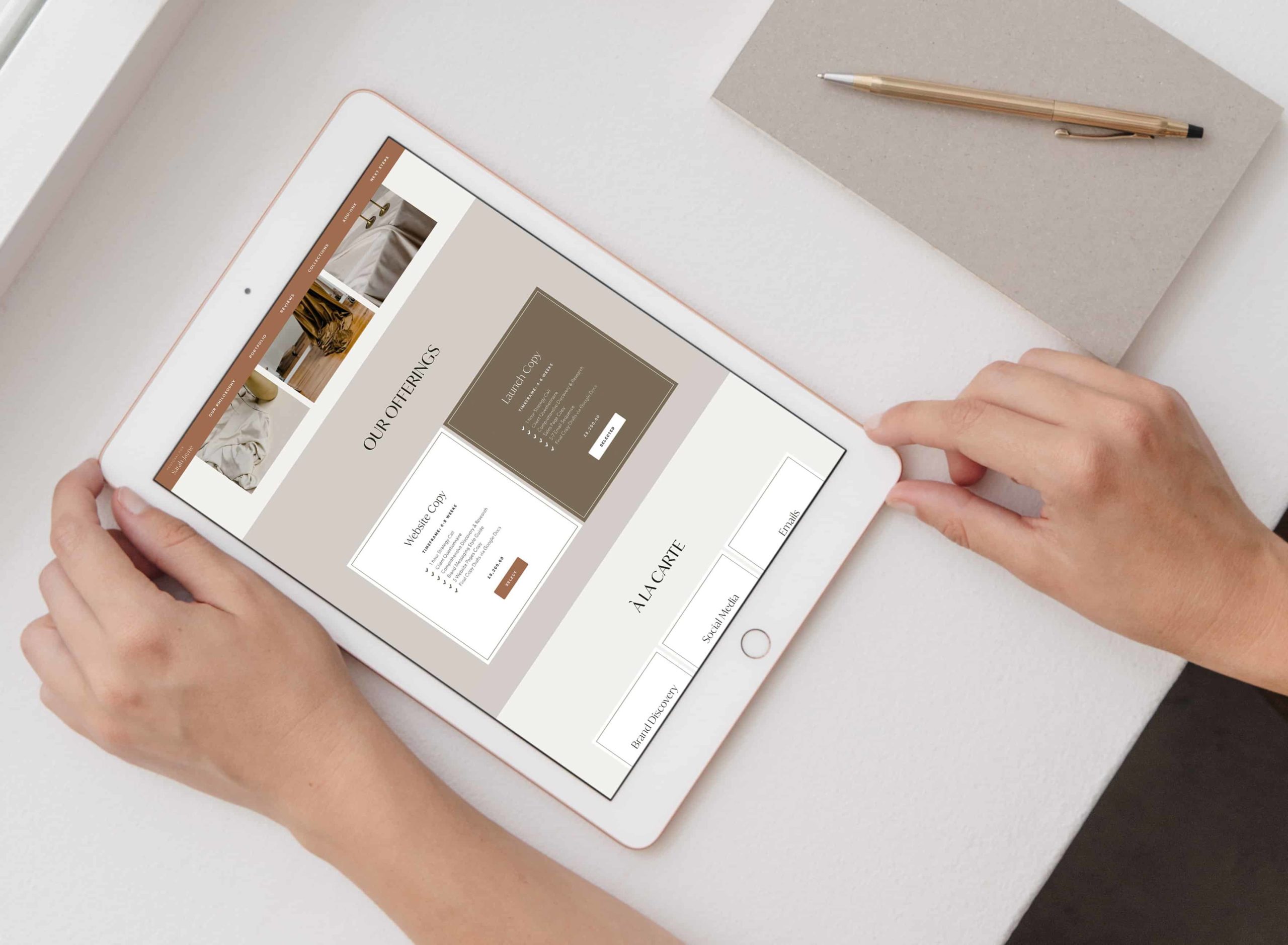
Selected Button Text
When clients choose their packages, the button will change colour. But in a bid to provide a better client experience, we can take it one step further and change the text to "Selected".

Drag in a Code Block anywhere on your form (to keep things neat, I usually keep all my additional code at the bottom) and add in the following CSS:
<style>
.packageSelected .btn.btn-squared.border-around:after {
    content: "ED";
}
</style>
Change on Hover
And how about enticing your clients to click by changing the text when clients are hovering over your package?
Add the following code before the closing </style> tag in the snippet above.
.packageNotSelected:hover .btn.btn-squared.border-around:after {
    content: "ED";
}

Change to Add to Cart
If you have a shop-type/order-form type proposal, it might make better sense to remove Select altogether and give your clients an experience more akin to how they would normally shop online–with an Add to Cart button.
To change the wording to "Add to Cart" or anything else, drag in a Code Block to the bottom (or if you have an existing CSS code block, add it in before the closing </style>):
<style>
span.btn.btn-squared.border-around {
visibility: hidden;
}
span.btn.btn-squared.border-around:after {
visibility: visible;
content: "Add to Cart";
display: block;
}
</style>

Added to Cart when Selected
In the same way as we added Selected to our button before, we can have: Added to Cart too!
Add this line of code to the end of the Code Block (before the</style> tag)
.packageSelected span.btn.btn-squared.border-around:after {
content: "Added to Cart"
}
Styling the button
You'll notice that the button is invisible, it now has no styling whatsoever.
So let's brand the button up! If you know a bit of CSS, go ahead and add your properties inside the selector.
Or head over to my post about customising buttons to learn how to style all the details.
Here's my working sample that you can tweak to your own branding (if you use the code below, you don't need the 2 snippets above):
<style>
	span.btn.btn-squared.border-around {
		visibility: hidden;
	}
	span.btn.btn-squared.border-around:after {
		visibility: visible;
		content: "Add to Cart";
		display: block;
		background-color: #BCBBB9;
		border: 1px solid #BCBBB9;
		padding: 11px 36px;
		font-size: 10px;
		font-family: 'Lato', sans-serif;
		letter-spacing: 1px;
		text-transform: uppercase;
		color: #ffffff;
		border-radius: 2px;
		transition: all .2s ease-in;
	}
</style>
Selected Button Colour
Technically this method means we are hiding Dubsado's button and replacing with our own fake button—so this means our button is no longer changing colour when clients click the package.
To control this, add this block of code before the closing </style> tag:
.packageSelected span.btn.btn-squared.border-around:after {
		background-color: #b7926c;
		border: 1px solid #b7926c;
		color: #ffffff;
	}
And tweak with your brand colours!
Select → Added to Cart

<style>
    span.btn.btn-squared.border-around {
        visibility: hidden;
    }
    span.btn.btn-squared.border-around:after {
        visibility: visible;
        content: "Select";
        display: block;
        background-color: #BCBBB9;
        border: 1px solid #BCBBB9;
        padding: 11px 36px;
        font-size: 10px;
        font-family: 'Lato', sans-serif;
        letter-spacing: 1px;
        text-transform: uppercase;
        color: #ffffff;
        border-radius: 2px;
        transition: all .2s ease-in;
    }
    .packageSelected span.btn.btn-squared.border-around:after {
      background-color: #b7926c;
      border: 1px solid #b7926c;
      color: #ffffff;
  }
  .packageSelected span.btn.btn-squared.border-around:after {
    content: "Added to Cart"
}
</style>
Don't forget to update the button styles!
